Big news! We are happy to announce to you the launch of our new Allion logo as part of the ongoing evolution of our company’s brand.
In the life of every company there comes a time when you need to evaluate who are you and moreover, who you’ve become, and then strive to accurately portray this identity to the world. Our professional profile has grown and evolved since we first launched in 2006 and with a team of over 200 strong, the caliber and scale of our service offering have transformed immeasurably, and so, the moment has come for our brand identity to reflect who we are today, our approach to client success, and to symbolize our dynamic future.
Our design and development team conducted countless creativity sessions, and have chosen a new logo that is modern and embodies the key elements that convey our mission to support businesses in their digital transformation journeys through adaptable technology, human collaboration, and operational excellence.
Fresh New Look
Our design goals were to better match our values, orientation for growth, portray our personality, and embody the users we serve. We worked to create something that communicated a modern elegance that spoke for Allion’s approachable, friendly, innovative, and dynamic nature. We brought focus to eloquent perfection with a more mature, modern, and solid typeface, whilst conveying our mission to deliver excellent services to our stakeholders; clients, partners, users, and employees, ensuring we remain true to our longstanding reputation and maintain the current pace of technology evolution.
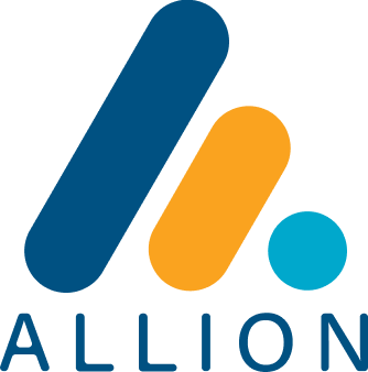
Symbols
The equilateral triangle that comprises the letter “A” represents the company name, but it’s stylized with curves to appear friendly, vibrant, and even depict modern tech stacks. The upward direction of the triangle signifies growth and incremental development. The simpler font selection for “ALLION’ symbolizes our desire to simplify human communication, our products, and tailored services.
Allion’s new logo exhibits two brand colors; shades of blue and gold. Proud as we are of our rich history and deep roots, we have retained the blue and added the new color competent of gold to embody honor, loyalty, and passion. Together these colors are symbolic of trust, convenience, friendliness, technological advancement, and security, as we strive to stay committed to strongly supporting our clients and remaining humble before the brand.
Corporate Website Makeover
Along with announcing our new brand identity, we were excited to give our corporate website a makeover. The new site delivers rich new content in a modern design and organized layout, featuring easier navigation, and improved functionality, to provide visitors with easy access to our solution information, highlighting our latest innovations in custom software solutions, modern frameworks, and engineering design.
The new logo and brand identity effectively reflect the bold, robust, energetic, and forward-thinking culture of Allion. It is implemented with the intent to inspire, ideate, and elevate us as we continue to provide best-in-class software development solutions to the global market.